Oct 29, 2024
Calculator App UI — Why Button Grouping Matters in Utility Design
Calculator apps may seem simple on the surface, but even the tiniest UI decisions can impact usability — especially when it comes to muscle memory and clarity.
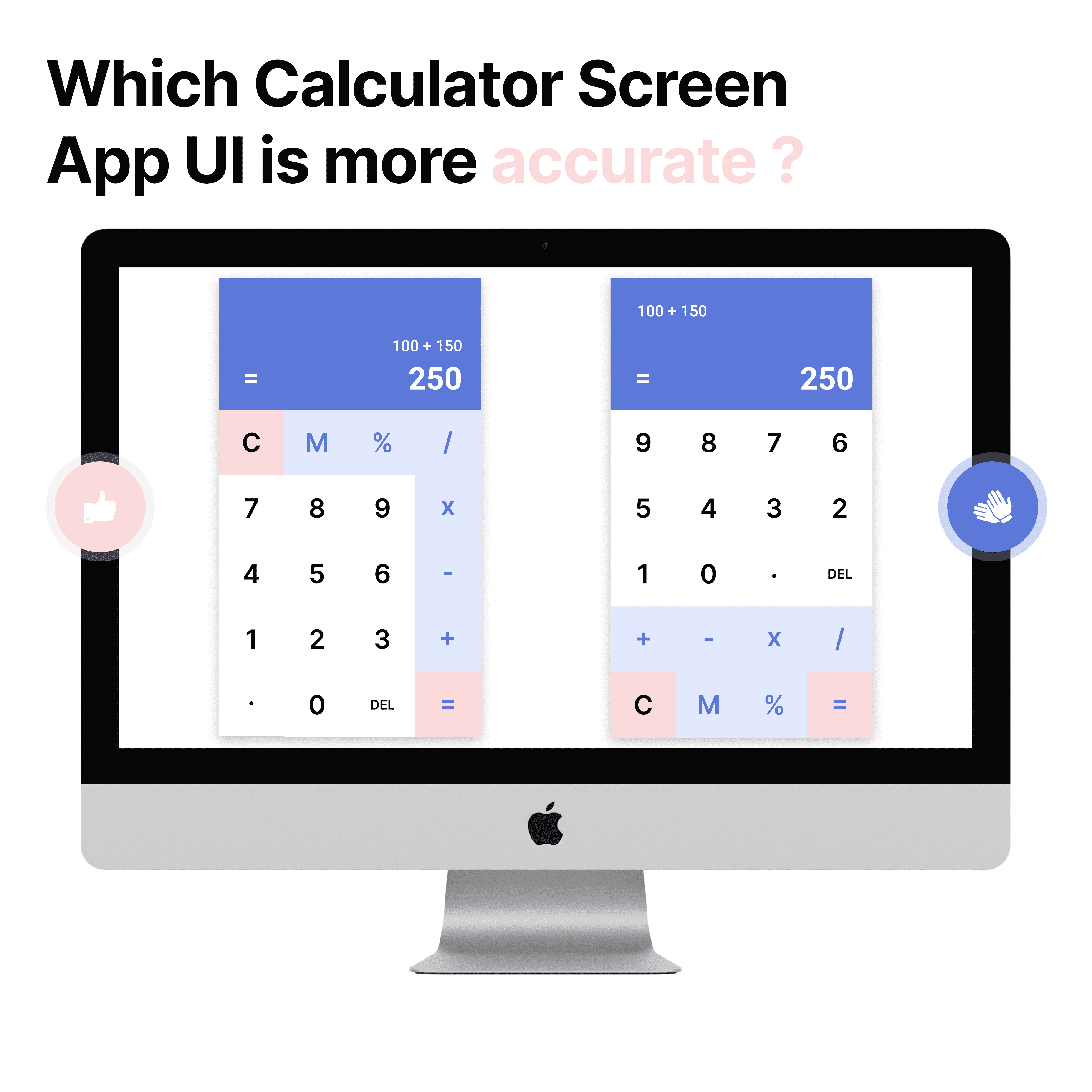
In this concept comparison, I explored two versions of a calculator UI:
Left screen: Operators and memory functions are grouped logically by color and area.
Right screen: Numbers are at the top, but the operators and memory tools are scattered across the lower section.
While both screens functionally achieve the same goal, the left layout aligns better with mental models users already have from physical calculators — grouping numbers, functions, and memory tools in predictable zones. Color differentiation adds another layer of clarity, letting users visually categorize buttons faster.
Design takeaway: In utility tools, hierarchy and spatial memory matter. Keeping familiar patterns intact improves speed, accuracy, and reduces the learning curve — even in the simplest apps.