Oct 28, 2024
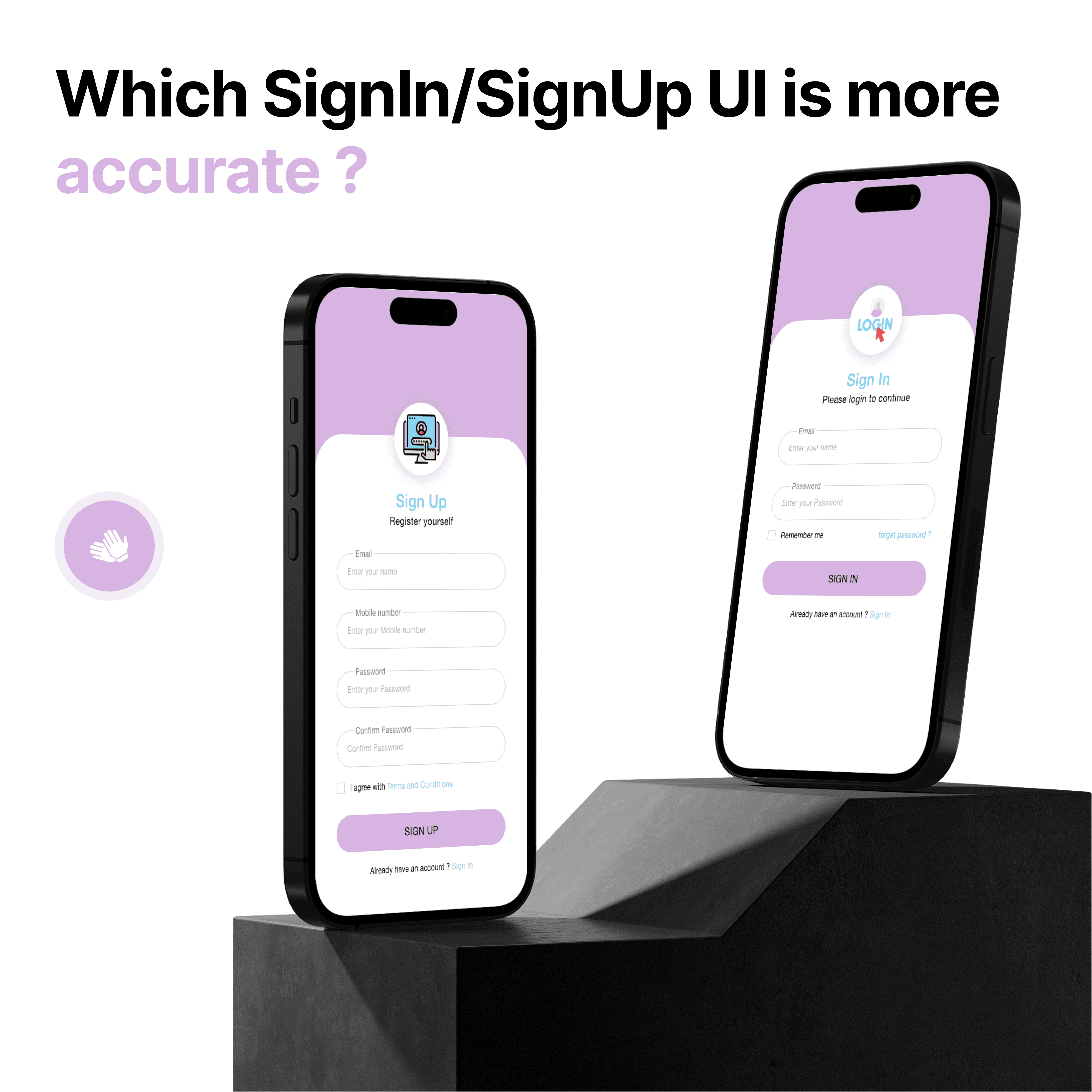
Sign In / Sign Up — Getting the First Step Right
The sign-in or sign-up screen is often the first impression users have of your app — and it determines how fast they convert or bounce.
In this experiment, I tested two approaches:
A Sign Up screen with multiple fields and a terms checkbox
A Sign In screen that’s lighter, with a “Remember Me” toggle and password recovery
What stands out is that both screens prioritize clarity, spacing, and intent. Field grouping and CTA contrast (purple on white) guide the eye smoothly. Error-prevention elements like "Confirm Password" and "Forgot Password" links ensure a complete, user-friendly experience.
Design takeaway: Reduce friction, provide help early, and make input as effortless as possible.