Oct 16, 2024
Finance Dashboard UI — Data That Feels Effortless
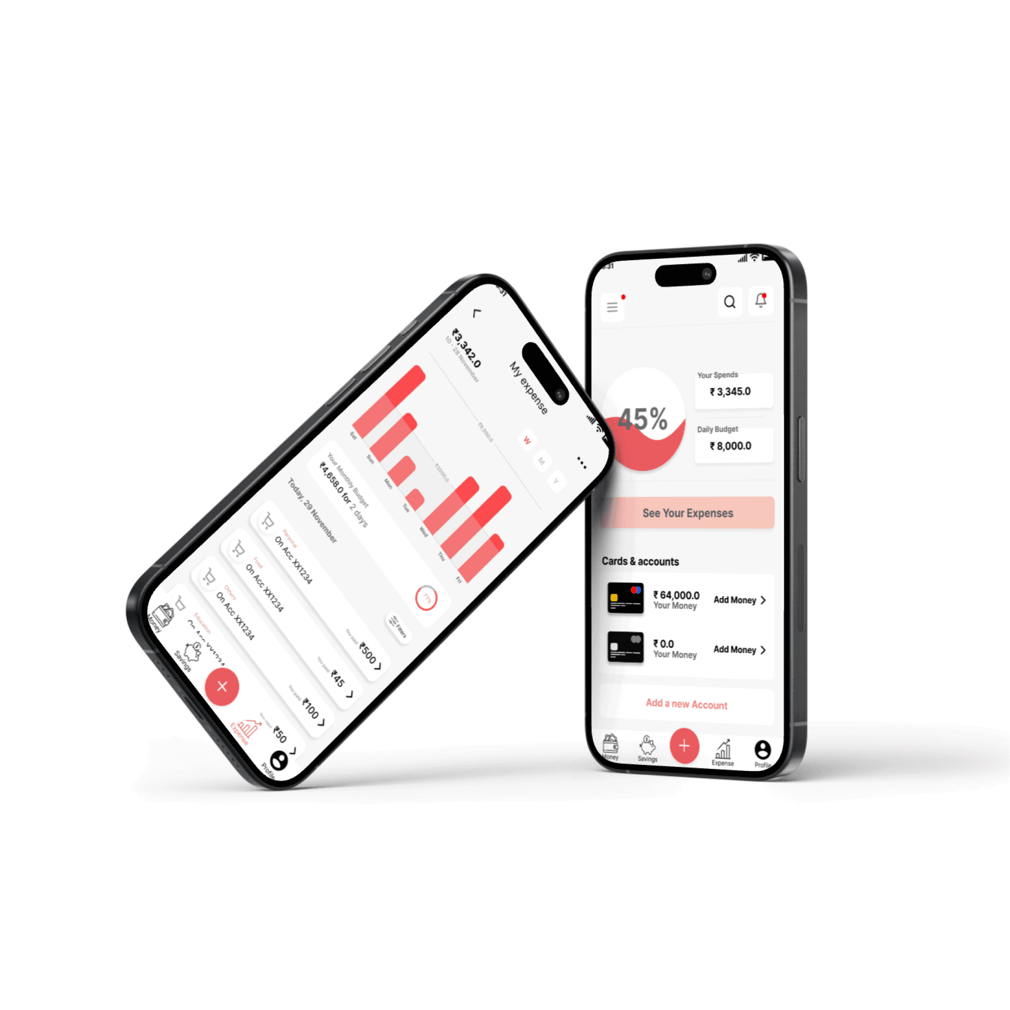
Financial apps often walk a tightrope between data density and user clarity. In this finance dashboard concept, I aimed to simplify the user’s understanding of their spending habits through focused visual storytelling.
Bar charts, bold typography, and a clear contrast ratio ensure users can understand their budget at a glance. The dual-screen setup showcases:
An overview of daily and monthly expenses
Cards, wallets, and account activity
Color usage was critical — I used red tones sparingly but intentionally, to draw attention to key financial stats without creating stress. The bottom nav is icon-based for familiarity, while CTA buttons remain contextually relevant.
Design takeaway: Keep financial UIs friendly and visual-first — users shouldn’t need a spreadsheet to feel in control.